Find out more here
I know building your email list can be a painfully slow process.
Even if you have a tantalizing incentive to give away, sometimes your prospects may still be hesitant to sign up.
Since readers are increasingly cautious about giving up their email addresses, you need to build trust and put in extra effort to turn casual readers into email subscribers.
While the top of your site’s sidebar is the “traditional�? spot for an email list opt-in form, you don’t want it to be your sole method for collecting email subscribers.
Today, I’m going to share improvements you can make to your site to grow your email list — and many take five minutes or less to implement!
How else can you get readers to subscribe?
Option #1: Blog post footers
If a site visitor takes the time to read one of your blog posts all the way to its end, he or she probably likes your content — so the footer of a blog post is the perfect place to ask that reader to sign up for your list.
You can add a permanent footer to each of your blog posts that prompts readers to join your list.
Check out this example from Copyhackers:
Option #2: Feature boxes
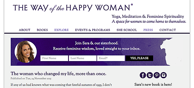
Feature boxes put your opt-in form front and center on your website, taking the place of a large graphic banner with your logo or other site branding.
A qualified designer can add one to your WordPress theme or you can use a theme with a built-in Feature Box, like StudioPress’s Generate Pro theme.
Here’s an example from The Way of the Happy Woman:
Option #3: Pop-overs
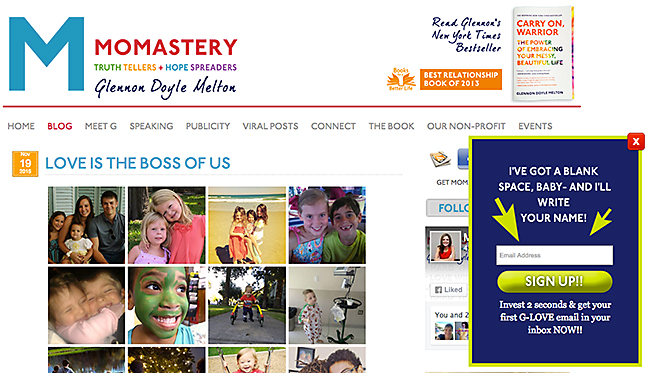
Pop-over opt-in forms are small boxes that pop up in the corner of your site (often in the bottom right corner).
They are less obtrusive than large, traditional pop-up boxes, and your reader can either take action — by entering their email address or closing the box — or they can simply ignore the box and continue consuming your content.
One of the best tools right now for creating simple pop-overs on your site is Sumo’s List Builder tool. List Builder is completely free, and it’s fairly quick to set up.
Adding Sumo to your Rainmaker Platform site is a breeze, whether you use the native integration feature (currently in Labs) or simply paste your script into your header using the Appearance editor.
Take a look at this entertaining pop-over form on Momastery:
Option #4: Pop-ups
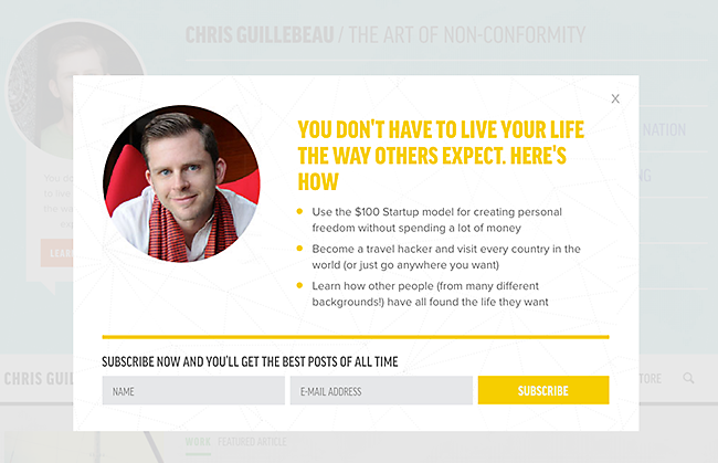
Putting a pop-up box on your site is highly contentious — using pop-ups may increase your sign-up rate, but it could also damage your relationship with your audience.
If you decide to use one for your site, the incentive you offer needs to be highly relevant to your readers.
A delay before the box appears is also a smart practice. This way, readers have a chance to momentarily browse your site before you present them with your pop-up box.
Chris Guillebeau uses this informative, benefits-driven pop-up form:
Persuade your readers with the right copy
Once you’ve figured out where you want to put the opt-in or registration calls to action on your site, you need the right copy to “sell�? what you’re giving away.
Your copy needs to be appealing, persuasive, and clear, so people know exactly what they’re getting in exchange for their email address and how they will benefit from it:
- Communicate your offer. If you have a free email autoresponder course, say that. If it’s a downloadable report, make that clear. Keep in mind that the title of your free incentive can do a lot of work for you — if you have an attention-getting, mouth-watering title, you probably don’t need to add a lot of additional copy.
- Describe your sign-up incentive’s specific benefits. How will your free incentive help your visitors? Will it save them time, make them more money, or improve their relationships? This is a great place to use bullet points, if you have the space for them.
- State exactly what readers need to do next. Make the next step crystal clear — this is not a place for ambiguity or cutesy language. You could write something as simple as, “Enter your preferred email address below, and click the red button.�?
Test to find the right combination
Don’t just go with your gut or take your best guess — test several opt-in and registration structures and several copy combinations until you find the ones that work best for your community members.
Small changes in your copy can influence your conversion rate, so test:
- The title of your incentive
- The headline on your opt-in form
- The copy in your bullet points
- The text on your “submit�? button
Yes, it takes extra time to test. But once you do, you’ll feel confident that you’re using the highest-converting version of your offer.
Growing your email list should be a top priority, and paying special attention to your opt-in forms is a strong step in the right direction to reaching your subscriber goals.
Finding the perfect opt-in for your website takes patience and persistence, but smart content marketers have both.
Keep trying, continue testing, and stay focused!
Read all the posts in our email marketing series
- How to Choose a Solid Email Service and Build Your List on a Firm Foundation
- Your Top-to-Bottom Email Checklist: What to Include Before You Hit Send
- Email Newsletters vs. Content Notifications: A Head-to-Head Comparison
- How to Write a Heroically Effective Email Autoresponder Series
- How to Write Email Subject Lines that Make People Stop, Click, and Read
- 13 Tantalizing Incentives that Will Build Your Email List
- CAN-SPAM 101: A Crash Course in Bulk Email Regulations
- 7 Deadly Sins and 7 Virtues of Email Marketing
- Your Step-by-Step Email Marketing Strategy Guide [Free Checklist]
Don’t miss any upcoming posts on Copyblogger!
Register for your free My.Copyblogger account to access our proven marketing training library. Plus, get fresh, free articles and audio content from Copyblogger and Rainmaker FM.


This article's comments are closed.