“We made the buttons on the screen look so good you’ll want to lick them.” – Steve Jobs
You’re creating great content to attract an audience. A loyal audience that comes to know, like, and trust you.
But what if you never get the attention of that audience in the first place?
What if your website visitors take one look at your well-written words and move right along because your page looks bland, boring, and amateurish?
You lose them at hello. Your words never have a chance to take root.
That’s where design can help. Design creates a welcoming first impression. It engages your site visitors and draws them in so they’ll actually spend time with your information.
It’s the difference between throwing some fast food on the table in front of your guests, and presenting a meal that’s carefully prepared, beautifully plated, and smells delicious.
Want to build up an appetite for your content?
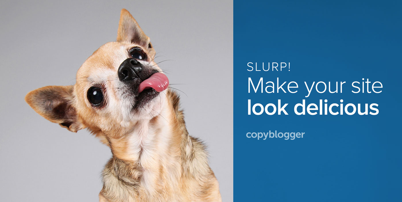
Today’s post shares six design tips to make your website look so luscious, you’ll need to warn people not to lick their screens.
1. Think about your guests
Delicious design starts with an understanding of who you’re cooking it up for.
Knowing your target market and what they’ll respond to is crucial if you want to pick typefaces, colors, and images that will resonate with them.
What do you need to know about them?
Ideally, you have a grasp of their age group, predominant gender, and education level.
Bonus points if you are aware of psychographic details like what motivates them, what their beliefs are, and what other companies they’re attracted to and buying from.
And just like you’d want to know about food allergies before you prepared a meal, it’s important to be aware of what your target market finds unpleasant or repulsive so you can avoid it on your pages.
2. Speak their language with typography
Custom typography allows you to break out of the Helvetica-Times Roman-Georgia-Verdana fonts our sites marched in lockstep to just a short time ago.
You can express your brand or your website’s personality through your typefaces’ personalities.
Serif typefaces — the ones with little “feet�? — are classic and traditional.
Sans-serif typefaces — those with streamlined letters — are contemporary and modern.
There are exceptions within these major categories, so trust your eyes to tell you what your typeface choices are saying.
It’s easy to use custom typefaces now. There are several good commercial offerings that will “serve up�? unique fonts to your site. The Google Font API will even do it for free.
It’s an extra step, but custom typography will make your content stand out, and give your words personality.
Here’s more on choosing and combining typefaces.
3. Use colors that make sense to your market
If you’ve carefully researched your target market as outlined in step one, you may already have an idea of what colors will work for them.
To start, I recommend you choose two main colors to represent your brand.
For you, two colors are simplest to work with — you’ll have a short list to choose from every time you need to make a color choice.
For your audience, two predominant colors will make it easier to recognize and remember your brand.
How can you pick just two colors from the millions available?
Start by looking at the consumer goods your target market already buys. What colors already appeal to them?
You don’t need to walk around your local shopping mall with a swatch book, but keep your eyes open to color combinations that are already being used to sell to your particular market. Take inspiration from what’s already working.
4. Tell your story with enticing images
I’ll be the first to admit it: finding a good image to work with your posts is a huge pain.
It adds to the time it takes to finish your article, and — because you typically look for an image after you’ve finished writing — it feels like just One More Thing To Do.
But, the payoff is worth the effort.
As wonderful as your carefully-crafted words may be, they’ll sit there limp and lonely on the page if you don’t pair them up with a compelling image.
A great image is like the cover of a dinner party invitation.
It gives people an easy “in�? to start engaging with your writing. Images are processed quickly, and if you’ve picked one that’s attractive and creates just a little bit of curiosity, it will draw readers into your headline and the first paragraph of your post.
5. Order your information hierarchically
Visual hierarchy helps your visitor navigate through your page and absorb your information in the order you prefer.
Sounds confusing, doesn’t it? Here’s how to make it work …
Look at the information on any given page of your website. What do you want your site visitors to notice first? It’s probably your site name.
Then what do you want them to see? It might be your headline, or the image you’ve used with your first post.
Once they’ve taken in the name of your site and you’ve drawn them into your content, then where do you want them to look?
Visual hierarchy directs the viewer’s eyes through your information by giving it an order of importance by where it’s positioned, how bold or bright it is, and how much white space it has around it.
The most important information? Make it larger, bolder, and brighter. Give it some breathing room, too: white space draws eyeballs.
The next-most-important information? Make it smaller, less bold, and not as bright.
As you move down the ladder of visual hierarchy, remember: the less important the information, the less visual “weight�? it should carry.
6. Keep it together with a style guide
OK, you’ve used color, typography, gorgeous images, and visual hierarchy to create lickable, luscious pages.
Now what?
Keep up the good work!
Maintain consistency with a simple style guide. It doesn’t have to be a complex 20-page document.
Try this:
- Open any word processor, and note your official colors
- Log your typefaces, and which font you use where
- List the file name for your official logo or header artwork, and where it can be found
- Note any resources for photography so you know where to find more of a style you’ve used in the past
- Continue to add to this document as you make design decisions about your website
Once you’ve created an attractive website, keep people coming back to it by serving up beautifully-presented content consistently over time.
Make good design decisions, then continue applying them using your style guide notes as a reference.
And don’t forget the “please don’t lick your screen” sign. You’re going to need it!
Editor’s note: The original version of this post was published on August 30, 2011.
Reader Comments (62)
Great tips, thanks. I will be using this when discussing briefs with clients – so many people think that content and design are two distinct phases, and they consequently miss out on opportunities to engage more effectively and (ultimately) convert more visitors.
Thanks, Stefan. It’s good to know the post will have a life beyond today! Glad it was useful to you.
You have to keep in mind that design is very subjective. If you ask 10 people what they think you should change about your website design, you’ll probably get 10 different answers. At the end of the day you have to stick to what you think is right and what your target audience is responding well too.
“… what your target audience is responding well to” is the key.
A little informal market research to find out never hurt, either. Even if you don’t get a consensus, you’ll know more than you did before you asked.
Pamela,
Typography and Color Scheme are the two things that stand out most to me when visiting a site. If either one of these two things aren’t attractive then I’m gone. I think Typography might be the single most important element of design. Words are just so powerful that your typography has to be flawless.
Thanks for the other tips. Great food for thought!
Speaking of colors, the main problem that I see that people are looking forward just to adding colors that are suposed to convert into sales, clicks,etc and they rarely think at the visitors first.
copyblogger is a terrific source for useful advice; however, I find the e-mail format to be very displeasing, with long scrolling text that makes me want to “come back later if I have time.” Perhaps some of these design ideas could be put to use to improve the copyblogger e-mail experience.
Hi Pamela, this is a great post. I agree that design really does matter, and Apple is one of the best cases to prove it.
As further proof, I saw a Nespresso machine for the first time about a month ago. It’s absolutely gorgeous. I drink coffee, mostly decaf, but I wanted the product partly because of how beautiful it was. Actually, I still want it. Not because I NEED it or HAVE to have it but because it’s gorgeous.
It seems that beautiful design appeals to emotions, and according to a study by Antonio Damasio, emotions are critical for decision making. If website owners want people to choose their site, it starts with beautiful design, granted it finishes with an effective user experience.
Thanks for the great post. I look forward to reading more of what you write.
They are beautiful machines, aren’t they? I don’t have one myself, but I can see how people would want one on their kitchen counter for the aesthetic appeal alone.
You had me at the headline! LOL!
I am a bit nervous about using the Google font API. Does it increase site load times a lot?
Thanks for another great post.
The headline is a nod to the famous Lifesavers ad headline, “Please Don’t Lick This Page.” 😉
There’s more about how the Google Font API affects load times here:
http://googlewebfonts.blogspot.com/2010/09/optimizing-use-of-google-font-api.html
The folks at Google seem pretty focused on speed nowadays, so I suspect they’re doing all they can to make those fonts load fast. If you visit the page above, you’ll find information about what you can do on your end to speed things up.
Marlene, I’m using Google fonts on my new site, and I was just out poking around Google Webmaster Tools a bit ago (mastering the fine art of procreating on a blog post) and my site load time is about a half second per page.
Having said that, I’m only using Google fonts in my headlines. (And I say “I”, but Pamela did the design, so I can’t take credit).
Nice post Pamela. I actually like the first point, “Think about your guests”. Thanks for the post.
I don’t have much of a background in design, but I LOVE experimenting with different colors, images and fonts. Of course, it’s difficult to actually test which design elements are more effective than others (and a previous commenter is right that everyone’s preferred design will be different), but it’s definitely fun to mess around with.
Thanks for sharing these great tips 🙂
It’s fun to experiment, Sarah, but I’m a big believer in following some basic guidelines so it’s not a complete shot in the dark.
Glad you enjoyed the post! 🙂
I usually look for or create the images first, because I know how annoying it is to do that last. Hah..your image is pretty funny though. Definitely made me check out this post
Thanks, Kent!
It’s not what I did this time, but I’ve used that technique before: find a great image, and use it as inspiration for a post.
Good design takes time, but it is extremely helpful. Thanks for sharing these tips.
This is a great post Pamela. However, I feel explaining with the help of visual examples would have worked better in my case.
Thanks
In all honesty Copyblogger has a design that is great to really look at and follow as a guideline, it’s clean and classic looking and has all of the essentials with none of the fluff.
One of my favorite site designs to emulate along with SocialTriggers, good inspirations for keep it simple and streamlined on your own blog.
I agree! Simple, clean sites let the content itself come to the forefront.
That’s the definition of good design, actually … it draws attention to the content, not to itself.
#4 is really important! I actually had a reader request MORE images when I was starting my blog. They grab attention and they can make or break a design based blog especially.
This doesn’t have to do with design but the last item (keep a style guide) triggered this tip: Bloggers and webmasters should keep style sheets for their TEXT. Why? If it’s spelled “Web site” in one post, it should be spelled the same in another, not “web site” then “website.” There are exceptions for guest bloggers, of course, but consistency plays a part in getting visitors to trust your page.
I’ll second that!
p.s. For those who are lazy (like me), utilities like Text Expander (Mac) or Activewords (Windows) make it easy to be consistent because you can set them automatically apply your styles by setting them to change an abbreviation to your rendition of the word. Example: you can type “ws” and the utility will substitude website.
Absolutely! This is the first thing a professional editor will do when they accept your project, and any well run communications or marketing department tends to have a style sheet. It’s a subtle thing, but that kind of consistency makes your content feel just a bit more trustworthy.
That’s an excellent suggestion, Lauren, and it’s something I teach in my course.
A copy style guide can include things like consistent spellings for words, as you mention, but also abbreviations, titles and the “boilerplate” copy that talks about what you offer.
I agree: it builds trust and looks more professional, too.
Does anyone know the best way to remove lick from an LCD screen? Just checking.
p.s. Great article Pamela. I think about “Think About Your Guests” a lot more these days because I seem to keep finding websites and books with fonts too small for my aging eyes.
Me too, Mike! I think it’s Derek Halpern who likes to say that “14 is the new 12” — in other words, to bump your typeface up to 14 points to take pity on all those 40+ eyeballs out there.
I have great news for you, Mike! People are finally realizing that larger fonts are easier to read. I’m seeing a trend of larger type all over the web.
Some of it goes too far and starts to look clunky, but overall font sizes are increasing based on what I’ve seen.
It makes sense: larger fonts are easier for eyes of all ages, and translate well to mobile devices, too. Fingers crossed that the trend will continue.
So does Zen Habits “go too far”? 😀 (Hey, you’re using 17 in your body.)
No seriously, I love how you use Google fonts. Gives a unique atmosphere.
I’m using Typekit on my blog, actually. 🙂
The tricky thing about fonts is that each one is drawn a bit differently, so 17 points in one font might look a lot smaller than 17 points in another. Kind of like women’s dress sizes — not that you’d know about that!
And no, Zen Habits doesn’t go too far. It looks lovely and spare, which is just what Leo is going for, I suspect.
Wow, I guess WordPress liked that comment so much it decided to publish it twice. I’m wondering which I should reply to …
Typekit. That’s actually even cooler than Google fonts and all, but now I’m embarrassed.
You’re totally right about the inequality. If you told chaparral-pro-1 to fit inside size 12, it’d suffocate.
I’ve always lapped up your advice on color and design Pamela particularly #3 Using colors that make sense to your market. Adding to that ..’and compliments your product.’
Having changed from a website color scheme that competed for attention with my designs to one that sits in behind, allowing the product to shine was excellent advice. I have extended this to off line print to great effect.
Thanks for sharing your expertise. Color and design makes a huge difference to conveying our message well.
xS
Siita, your site is living proof that these rules work! It has been a lot of fun to watch it transform before our eyes.
Great list Pamela, very helpful.
Thanks,
AJ
Great minds think alike, Pamela! I wrote a piece a few months back called “How to keep your dinner guest in mind” which expands on your idea in #1: http://thewordchef.com/2011/04/keep-your-dinner-guest-in-mind/.
Screen-lickage is definitely something I strive for…luckily my theme is food so enticing photos are easier to find.
Just visited your post: that is so cool!
And yes, you are very lucky to be able to work with food photos. Who doesn’t like to look at yummy food?
Thanks for the comment, Tea.
Wonderful write up again Pamela, Good Job. I like the way you highlight the importance of design. Maintaining a professional look, will always set a good impression in a potential customers mind.
Hi Pamela,
Sensational tips!
Finding the right image works really well. We live through our senses most of the time. Appeal to the senses with a clever, colorful pic which is relevant to the post. This gets an instant smile and read virtually every single time.
Thanks for sharing your insight with us!
RB
Thanks Pamela for the tips, I finally decided to put together a simple styleguide for all my websites thanks to this post. It will now save me time from always checking through my code/website for picture dimensions and website colors.
Now that is excellent news! I think you’ll find it’s time well spent. I have a very simple one, too, and find myself referring to it several times a week.
Great post. A lot of people don’t realize that you have only a few seconds to capture and draw a brand new visitor in. A visitor can’t read your content in that amount of time, no matter how great your writing is. So you have to grab their attention with the look and feel of your site, and you have done a great job of listing the steps to do that.
Thanks, Lionel. The look and feel are the first things to hit people. If you get those right, people will decide to spend more time digging in and reading. 🙂
I really like your article. Very nice writing too. Very informative! Thanks for writing it!
I’m not a design genius in any way, so I find it rather hard to style my site to look like I paid 10.000 dollars for it.
But It’s good inspiration – and thanks for the post.
I have a wordpress theme that let’s me do everything I want, but most blogs look the same anyway.
What would you do if – lets’ say – you had to restyle this website?
all the best
Simon
Great read! I went back to my site to make some tweaks in the posts on my blog based on some of the suggestions presented and I’m a lot more satisfied with the aesthetic 🙂
Glad it was helpful, NayMarie.
That’s a super cool animation you have on your home page, by the way. Hypnotizing, but in a good way!
Good tips.. I personally like clean templates or clean sites. There are so many people trying to be so different that they clutter up their designs.
Good information, but this article would have been 50 times more helpful if visual examples had been included. Thanks.
Great tips, Pamela, every blogger should read!
Being a designer myself, I do know very well that image is a very powerful tool.
Most people, don’t.
Good design is not subjective; in fact it does have a great impact on our senses and mood, often subconsciously.
First impressions are crucial. Bad -and not functional- design could send our readers away instantly.
The right image can “sell” our content, services or products silently.
Those who know its secret power, use good design to their advantage.
A great content is just not enough with so much competition out there.
Actually, a well-designed blog or website differentiate professionals from amateurs. Either we like it or not!
Great tips. I’ll use in my blog because I know how much better the design, more attention will hold the reader.
Actually I clicked on this link on my feedly just because of the chihuahua.
I guess this lays in the design point.
Your click totally proves the point about images, Ricardo! Thanks for letting me know it worked. 🙂
Hi Pamela, some good tips. Thinking about the user experience and matching it to your target market demographics is a great tip. I also like the idea of settling on 2 main colors in relation to your defining your brand.
Whilst keeping your content hierarchy structured seems quite logical it is surprising how many websites don’t actually do it.
I’m intrigued by your suggestions to pick two colors. Many times I’ve read where you should have only one main color. I’ve struggled with color choice. Should my main color invoke trust, confidence, or action? Thanks for sharing the great idea on looking at existing sites in the market.
Hi David,
I think two colors gives you a bit more flexibility. And having two main colors allows you to invoke different things: you could use blue to look trustworthy and orange to motivate people to act, for example.
Thanks for sharing this. I especially like what you wrote about fonts (serif, sans serif). Stylistically, I think a lot of people get caught up in thinking about the design they would prefer rather than what their target audience would prefer.
Though – I am partial to the minimalist trend that’s taking over the internet now.
Anyway- great post. Thanks!
This article's comments are closed.