Today’s makeover is for Steve Lee’s fiction thriller, What If …? Trying to sell a novel direct is a daunting task, and frankly few will sell enough copies to be profitable. (Those that did usually had a tremendous ‘hook’ and lucked into the right place, right time, right message astral alignment to generate a lot of buzz.) When he wrote me last month, he was seeing a 1% conversion. His desire is to double, perhaps even triple the rate.
He’s happy with his page design, I’m not. The copy – and there’s a lot of it – is all over the place and lacks focus, simplicity and clarity. I don’t read much fiction (although one of my guilty pleasures are vampire novels), but Steve has written a clever mash-up of fast-paced thriller with a Christian/Islamic/Buddhist message designed for the secular market. Now that’s a triple-threat of the first order. So let’s see what we can do for Stevens eco-conscious, spiritually-themed thriller.
Here’s the background:
- The Goal
Increase book sale conversions from 1% to as much as 3%. - The Problem
Site is receiving traffic, though not enough of the book-buying kind. - The Current Landing Page
http://www.steve-n-lee.com - Page/Ad that Generates the Click-Through
Nothing specific at this time. - Book cost
$17.99
The Maven’s 10-Point Critique
#1 – Your book needs a landing page of its own, even if it’s steve-n-lee.com/book and hangs off your main site.
As I’ve noted in most of the makeovers, your landing page needs to be stripped of all non-selling components, including navigation, that distract your reader from moving through your copy. If it doesn’t help sell, it shouldn’t be there.
#2 – You’re an unknown author, so try to link your kind of story with a better known story in the same genre so your prospects know what to expect.
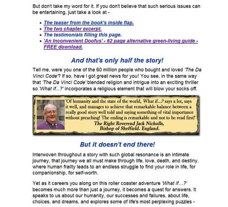
You do this several paragraphs in. I suggest you drag the DaVinci Code reference and make it a strong subhead toward the top of the page. “If you were one of the 60 million readers who were mesmerized by the “DaVinci Code”, you’re going to love “What if …” Then kick out with a particularly juicy excerpt (not a link) and then continue building your case with more excepts, testimonials/reviews, etc.
#3 – Create a specific “3-D” profile of the target reader in your head and craft your copy to that one person.
60 million people may have read DaVinci Code, but who was the “perfect” DaVinci Code reader. Male or female? Religious or just spiritual? Old or young? Conspiracy theorists? Anti-church folks? (I found the premise intriguing and had actually read its source material, Holy Blood, Holy Grail, several years ago. I thought the actual writing of DVC was really quite awful.) By writing specifically to that one target reader, your copy will almost magically be more on-point, more exciting and persuasive. Remember, you’re looking to get folks to buy your book, not just keep it in mind next time they’re at the store or trolling Amazon.
#4 – You’re selling a story … DON’T LEAD WITH THE PRICE, especially a discounted price. So start telling me your story right off the bat.
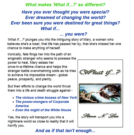
Leading with a price discount is a fine offer when you’re selling commodities or when you’re looking to sell to customers who don’t need a lot of explanation. Otherwise, you need to connect with your prospects at a completely different level. If no one needs your story, then you need to make the case why a reader would want your story — and want it enough to pay for it from an unknown author. You’ve done this, but too far down. Open up your landing page with your questions: “Have you ever thought you were special? Ever dreamed of changing the world? Ever been sure you were destined for great things? What if… you were?” Now that’s a compelling opening!
#5 – You’ve written a thriller, so show me a robust, thriller-type, visual style.
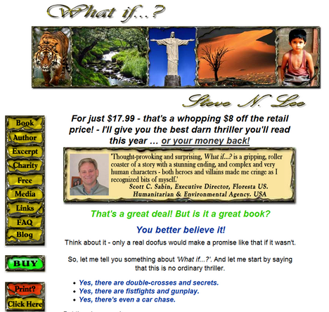
Thrillers by their very nature are beasts of the dark. (Look at other sites selling books in the thriller genre.) Lots of shadow, high contrast, blacks and reds and grays. Perhaps a Patterson or Baldacci could get away with a landing page that takes a contrarian approach because their name brand is highly recognized. Otherwise make it look like what it is. Instead of a banner strip of photos that forces the reader to wonder what the connection is, let your book cover be the highlight of the page and use the smaller photos as accents along side applicable copy.
#6 – Don’t write to be clever, write to be clear.
Writing clever is all about drawing attention to the writer. Writing for clarity, on the other hand, is all about respecting your reader. Clever in small doses in an excerpt or pull-quote can add a nice zestiness to ad copy, but your reader can’t and won’t digest a whole meal of it. Satisfy your prospect’s curiosity with something tasty and solid to chew on. I promise they’ll keep reading.
#7 – The overall look of the page is confusing and overwrought.
I know you like your page layout but, to my eye at least, it immediately pegs you as a ‘do-it-yourself-er’ and it’s probably hurting your sales. At first glance, I wasn’t sure where to look or at what. Your visitors will have an immediate, visceral feeling when they first come to your page. I’m talking 1-3 seconds. If your page looks amateurish there’s no question they’ll make the same judgment – rightly or wrongly – about your book.
You want a crisp, clean look that supports your copy, makes it easy for your prospect to move through the page, and uses familiar web page conventions. So, if you’re selling a book, show me the book and put it in the hero position, above the fold, preferably flush left. Add the first BUY BUTTOM near it, perhaps in the caption area. Show me a picture of you before you show me a picture of your testimonial guy. (I thought testimonial guy was you at first glance.)
Speaking of testimonials, they’re great but the current visual treatment causes them to overwhelm the rest of the page. Strip the goth borders from the testimonials as well as the navigation. (You’ll be limiting the navigation and outbound links anyway.) Keep the photo, pastel background and copy blocks.
The Arial font is used too large, uses too much italic, too many colors, and screams “look at me!” but not “read more of me.” Verdana and Georgia are fonts developed specifically for the web. Use them for body copy, augment with Arial or something complementary for headlines and subheads. Subheads should be no more than 2 points bigger than the body copy, headline no more than 2 points larger than the subhead.
#8 – Put your “Preview the First Two Chapters” links early on the page. Dump the book jacket info link.
Your instincts are good about providing chapters. Let’s call them that and make sure the links say that, too. Simplify the copy and the process, too. Too much clicking to get to something else. Also, eliminate the flash version. I couldn’t make it work in Firefox 2.x so I’m just going to guess that folks are having trouble, getting frustrated and leaving your site. (Remember, they don’t absolutely NEED what you’re selling.) Go with the simple chapter replication.
#9 – Don’t offer a freebie NOT DIRECTLY CONNECTED to the product you’re selling.
By offering your readers An Inconvenient Doofus on the same selling space as What If … you’ve given them a reason to click away for free. Better to use this as a bonus for buying your main book.
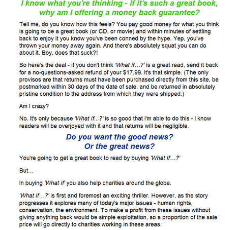
#10 – Eliminate the guarantee and highlight the charity angle.
Don’t get me wrong, I love guarantees. But for a fiction offer it feels forced and a bit trite. However, offering to donate a portion of your sales to charity is a good one. Better to be specific with the names of the charities, as well, to make your effort seem more credible. I might even have a little gauge showing how much money has been raised thus far.
Steve was happy to offer a free copy of An Inconvenient Doofus to Copyblogger readers. My additional thanks to Steve N. Lee for his patience and support of Heifer International.
Here’s your chance to be the Copywriting Maven’s next landing page makeover!
Got a landing page that’s more poop than pop? Willing to share with Copyblogger readers? Prepared to put a little of your own “skin in the game�? for a Maven Makeover? Then follow your click to Maven’s Landing Page Makeover page for all the details. (Please note that I’m booked for gratis critiques until 1/15/08. If you’re interested in a private critique/makeover [5 business day turnaround], please email me directly.)
Reader Comments (23)
That’s kind of too bad that the free book offer is not available for download, poor links are #1 reason for leaving a site?
I’ll contact the author ASAP to remedy. In the meantime, you’re welcome to email him at his site for a copy.
HERE’S THE CORRECT LINK FOR THE FREE DOWNLOAD.
This is a great critique.
For #7, though, just to be perverse, I think Steve ought to split test the format.
The idea of using a traditional info marketing long form squeeze page to sell a novel is just weird enough that it might work–and it might hook people who never buy books, but do buy Yanik Silver/Dan Kennedy/etc. products. Worth testing out, anyway.
If only because it sounds as if the author doesn’t think it’s true, I feel the need to say that for my money the page design is awful. The header, border around the testimonials and the navigation are especially bad. They remind me of the free designs you used to get with applications in the late 90s. A complete and utter put off for me at least.
Although I’m always of the view that copywriters, and particularly those who do landing pages, never put enough thought into aesthetics. Maybe I’m just shallow.
Roberta clearly cares about design, which is why she called Steve out on it twice.
Words are crucial, but a bad design can keep people from reading any of them.
Sorry Brian, I should have clarified. I meant the author of the book, not the critique – who did a good job of pointing out some of the problems.
I think this is a super critique, and while I might take issue with one or another of the individual points, I think anyone would agree that the overall revamped result is MUCH more likely to attract buyers than the original. My site is DIY and looks it, which I am sure has lost me business. I’m having it professionally redesigned right now, with an emphasis on clarity and simplicity. I have several books I’m going to want to sell eventually, and this makeover is going straight into my “recipe file.” Thanks!
@ Sonia – You’re right, that is perverse. But I like the idea of running an A/B on the two. If the whole thing were properly executed, he might get the people who are more used to buying things from long copy landing pages.
Although, IMO, whichever one he goes with, I’d bring it further up the page. Might be construed as “last ditch effort” at the end.
As usual…great critique.
I really liked the fact that you pointed out the need for landing page copy to be alluring, clear and crisp.
All too often we forget that our readers need direct connection in a back-to-the-basics manners.
And As always…Thanks for the Great Critique!
The navigation serves as a distraction and needs to be removed. Also the headline is weak and should be more specific to draw in the visitor. It’s estimated that 70% of an ads success can be attributed to the headline alone.
Did you just call that guy a tool in point number 8?
I’m guessing that was supposed to be “too.”
Fixed. 🙂
Hahaha … thanks for the catch on that.
😉
You were right on target with most points but after 25 years in main stream publishing (and now as a free lance book editor) I would suggest that #2 – comparing his work to the DaVinci Code – could be a major misstep. First, everybody and his grandmother has been making that comparison since the book hit the NYT list. Second, no other book has lived up to the hype. Third, if it WERE that good he would have found an agent and publisher. Fourth, the DaVinci Code is old news. If anything, he should emphasize a fresh approach – although, please, NEVER use the work unique!
Virginia, in most respects, I couldn’t agree more. However, I will quibble on one point. I think more and more authors of all stripes/experience levels/talent are taking the plunge into self-publishing. Unlike the old days, self-publishing – in and of itself – no longer has a taint.
Hi everyone,
This was my makeover, so I felt it would be beneficial to make a few points about why I did what I did, which hopefully may stop others making the same mistakes.
But first, a big ‘thank you’ to Roberta for an excellent review. If anyone’s on the fence about whether to indulge – do it! Really, you’ll be so pleased you did.
The overall look of the site was to try to give a crisp, clean image with the fewest distractions possible –good thinking, poor execution! Hence there was only one column of text, little in the way of images, lots of white space so the reader wouldn’t feel overwhelmed. And comprehensive links to everything imaginable. Oh, well…
The headline was developed after reading ‘The Irresistible Offer’ by Mark Joyner. (Writing copy is new to me so I’ve tried to read up on it.) This seemed a fair idea, so I went with it. However, the ‘headline’ Roberta pointed out would be better was in fact my first choice up to reading Joyner’s book. (The headline has now be replaced.)
The white background was to present a clean, crisp appearance. (Now changed to black, with flashes of colour for interest/contrast.)
By going with a white background and as few distractions as possible, my choices for presenting the testimonials were somewhat reduced. I was aware they were prominent (which I thought was good as they were important aspects of the copy and should draw the readers attention) but didn’t realize they were ‘so’ prominent (The testimonials have been revamped to be more in line with the rest of the copy and less of a distraction.)
The chrome borders to the images was a theme from the images on the back of the book itself (the banner photos you see in the first illustration). This effect was carried over onto the navigation for consistency. (All but one of the nav buttons have now been removed.)
The font was quite large to make it easily readable at any size resolution. (Reduced to the more common size of body text font found on websites)
The author photo was on a separate page so that extra info could accompany it, info that would have overwhelmed a landing page. (The photo has been reduced in size and repositioned.)
A full navigation system was provided so browsers had access to everything imaginable on the site. I was worried this meant they might click away using one of the links to other sites, but I figured the information provided ‘might’ make that worth it — if browsers perceived value in what I was presenting in a web page, that might translate into value in my book. (The nav bar is now gone. By getting rid of it the book image has been moved to the top of the screen, to the hero position.)
The copy has been condensed and re-styled in parts for a more cohesive whole. This was made easier by replacing the original headline. Also, as per Roberta’s suggestions, tiny excerpts of the book have been added to spice up the copy.
The guarantee was part of the headline so details had to be included. Plus I figured a guarantee would give readers extra confidence to buy. Like I said, writing copy is new, so I didn’t appreciate the negative aspects of such a guarantee. (Now deleted.)
There were two sample chapter styles – one a simple web page, one a flash presentation. The flash looked really cool with pages that turned over like real pages. I figured providing a quality sample would show it was a quality product. Unfortunately, I didn’t know the software I’d bought to produce the presentation was so unreliable (tests were fine on the whole). (The chapters link directly from the landing page now and the flash has been removed.)
As you can see I had a decent instinct of what to do just not how to do it. Roberta has pointed me in the right direction on a lot of these issues.
Please feel free to take a look at the revamped site. It’s not perfect, but I’m sure you’ll agree it’s a vast improvement thanks to Roberta’s input. (Only the landing page and FAQ pages have been updated so far.)
I hope readers find this insight helpful.
Thanks, Roberta. Excellent job.
Cheers,
Steve
Author of suspense thriller ‘What if…?’
http://www.steve-n-lee.com
My pleasure, Steven 🙂
This article's comments are closed.